Chosen Architects: Kenzo Tange & Kazuyo Sejima
Concepts Chosen:
Kenzo Tange
Emphasis on functionality and purpose
The geography of the design gave an axis view from the museum to shrine to the A-bomb dome. This view reinforces the atmosphere suited to accentuate destruction caused by the bombing and the need for peace.
Blending of modernism with traditional Japanese culture and heritage
While the main peace museum retains a fairly modern feel, the park itself is littered with numerous traditional Japanese statues, monuments and shrines which remain significant to the local population.
Focusing on traffic routes and circulation around the site
Tange placed traffic and circulation especially in priority when designing the layout of the Hiroshima peace park. Initially planning the roads and pathways before laying out plans for buildings.
Reacting to the threat of danger
The yoyogi gymnasium can be seen as a structure built as a statement of strength and recovery after WW2. Furthermore with the aftermath of allied bombings in Japan and the uncertainty of the future, it remains fairly apparent that the building was designed to be resilient to future bombings.
Staying true to basic geometric form
Most of Tange's works including the Shizuoka Press and Broadcasting Centre and the Hiroshima Peace Museum retain the form of geometric shapes such as cubes and prisms.
Kazuyo Sejima
Glass and transparency - Blending and seamless transition between the interior and exterior
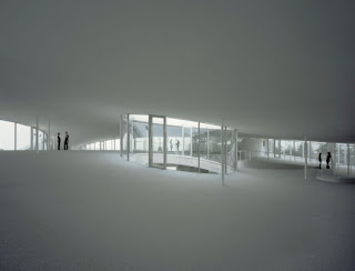
Numerous buildings designed by SANAA have often included glass and transparency as a theme within their design such as the Rolex Learning Centre where it is used to create a connection between interior and exterior spaces as well as to allow natural light to flow in.
Increasing the interactions and socialisation of the people within
The building was designed to match the organic, non-linear and curved movements of people thus increasing the chances of interactions of people compared to otherwise linear pathways which can only create crossroads where people could bump into each other.
Openness of Space
The Rolex Learning Centre was designed to be open to anyone and everyone. Thus the building was created with a natural inviting atmosphere.
Minimalism
Sejima has also shown in her buildings to make several many valued choices during the design process. Examples can be seen in the Museum of Contemporary art where a layer of gauze was added to the exterior facade of the building for numerous reasons such as reflecting light, aesthetics and to stand out from other buildings.
Complexity in Simplicity
To describe the Museum of Contemporary Art at its core it is essentially a bunch of irregular blocks stacked on top of each other to forming a building. However it is through the way the blocks are stacked and also the lack of supports on the ground floor that give the building a sense of complexity to the beholder.
Axonometric Drawings:
Concepts chosen:
1. Staying true to basic geometric form
2. Reacting to the threat of danger
3. Increasing the interactions of those within
4. Openness of Space
5. Minimalism
6. Complexity though Simplicity


No comments:
Post a Comment