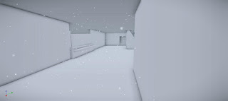
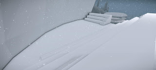
Google Sketchup Model:
http://sketchup.google.com/3dwarehouse/details?mid=8b39efb78d28e5e7f957bcc94a4f05db
Cryengine Model: Unfortunately after applying textures onto my model and exporting it, cryengine didn't like it and decided to kill itself and destroy the entire levels folder and delete my entire environment. :(
Victor Lim
Saturday, 29 June 2013
Video Final Model
Youtube link to video
Video was taken before textures were added and crashed my save data. However it still shows the circulation around the building and facilities fairly well.
Some of the main things I wanted to emphasise in my design was efficiency and creativity. That would be a building that encompasses the subjects it teaches while allowing the students to enjoy learning in it. Some of the main considerations I put was to separate the 'Work' and 'Leisure' spaces. Places all the workshops, study areas and library in the central semi-snow globe in the middle of the bridge and place the cafeteria/meeting space outside, along with the staff and student meeting spaces outside as well. By doing so it allows students who wish to study the chance to do so in the workshops or library without getting interrupted and distracted by those who wish to play or socialise thus creating a solid place for learning. Also I placed the library and gallery on the floor as I would deem it to be the more high traffic spaces of the school, which reduces the congestion on stairs. Furthermore I have also decided to split the meeting spaces of staff and students and I feel as people generally like to socialise and interact with people of their own age, however the balcony in the centre allows them to interact with each other if they wish to do so. Furthermore the staff offices were placed it in highest point in the building due to circulation as it mean only the little staff have to use the stairs as much and lessens overall congestion on the stairs while also providing the staff with the best vantage point in the building.
Real Time images of Developed Model and Environment
Entrance to School
Panorama of the Valley
Overview of Environment
Bridge onlooking meeting student meeting space and elevator (left)
Note the transparency in the bridge, which is used to allow for onlookers on top to see and perhaps identify people on the valley floor before boarding the elevator down and also to add to the view of the scenery.
Interior of the teacher's meeting space, onlooking the students meeting space.
Cafeteria and secondary space for students and staff to meet and interact.
Balcony of Cafeteria onlooking the Staff meeting space
Birds eye view of the entire landscape
Lecture Theatre
The lecture theatre is positioned in a way that allows for natural light to flow in while lessening glare for students if it were positioned directly in front of the sun. Furthermore with the students facing inwards instead of outwards the students are more likely to pay attention in class than get distracted and look out into the landscape.
Workshop/Research space
This texture was chosen for the workshop as it is a fairly innovative and unique texture which may in turn spawn more creative thinking in the students design.
Ground floor onlooking the staircase and gallery space/general meeting area
texture was chosen for the same reason as the workshop
Library/Computer rooms
This repetitive pattern was chosen to show that it is a public space and that you are but one of many using the space. It may allow for one to be more conscious of their actions and its effect/disruption on others.
Collective Offices of Staff
The offices of the staff are placed in the highest point in the building for its better view for the more permanent users of the building. It can also onlook down into the lecture theatre and studio spaces allowing for staff to see what others are up to.
Side view of Valley with elevators descending.
Rear facade of Folly
View from folly
Low angle shot of the building
Two Studio spaces
Elevators and Folly
The Elevators both display a sense of thought and design of both an engineering standpoint and architectural through utilising many valued choices throughout the design process. The student's lift (left) is created utilising circular shapes as they have a larger surface area. There is also multi-levels steps which allow for several students to be able to board the lift at a given time, improving circulation from the valley to the school. The teacher's lift however is much more small and personal allowing for maybe only one or two individuals to step on, giving it a more personalised environment and also due to the smaller ratio of teachers to students, they do not need such a large lift.
Furthermore the lifts are open as to fully embrace the exterior environment allowing for the individual to experience the valley with all their senses. The lifts also slowly rotate around as they descend imitating the fall of snow around them, while also allowing for the individual to get a 360 degrees view of the valley.
Furthermore the lifts are open as to fully embrace the exterior environment allowing for the individual to experience the valley with all their senses. The lifts also slowly rotate around as they descend imitating the fall of snow around them, while also allowing for the individual to get a 360 degrees view of the valley.
The folly is extremely similar to the lifts in that it allows for the exterior to penetrate the interior compared to the actual school which is relatively closed to the elements.
Subscribe to:
Comments (Atom)


